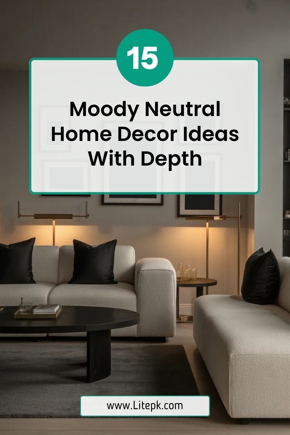
14 Neutral Home Mood Board Ideas For Calm Spaces
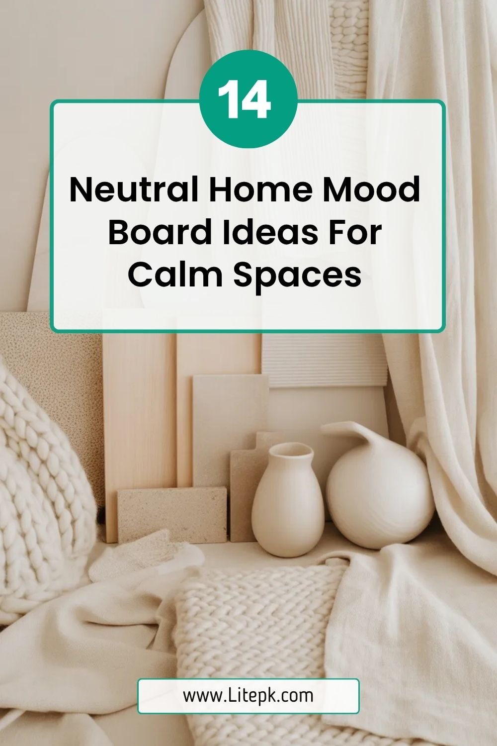
A well-designed neutral home mood board is the foundation of a calm, cohesive, and effortlessly elegant interior. It allows you to visualize textures, tones, and materials before committing to a full design—ensuring your space feels balanced and intentional. Instead of guessing what works together, a curated mood board helps you build harmony from the very beginning.
Designers rely on neutral home mood boards to create spaces that feel peaceful yet sophisticated. By blending warm tones, layered textures, and subtle contrasts, these boards guide every decision—from furniture selection to finishing details. Whether you’re designing a living room, bedroom, or entire home, these ideas will help you craft a serene and timeless aesthetic.
1. Warm Beige and Soft Ivory Harmony
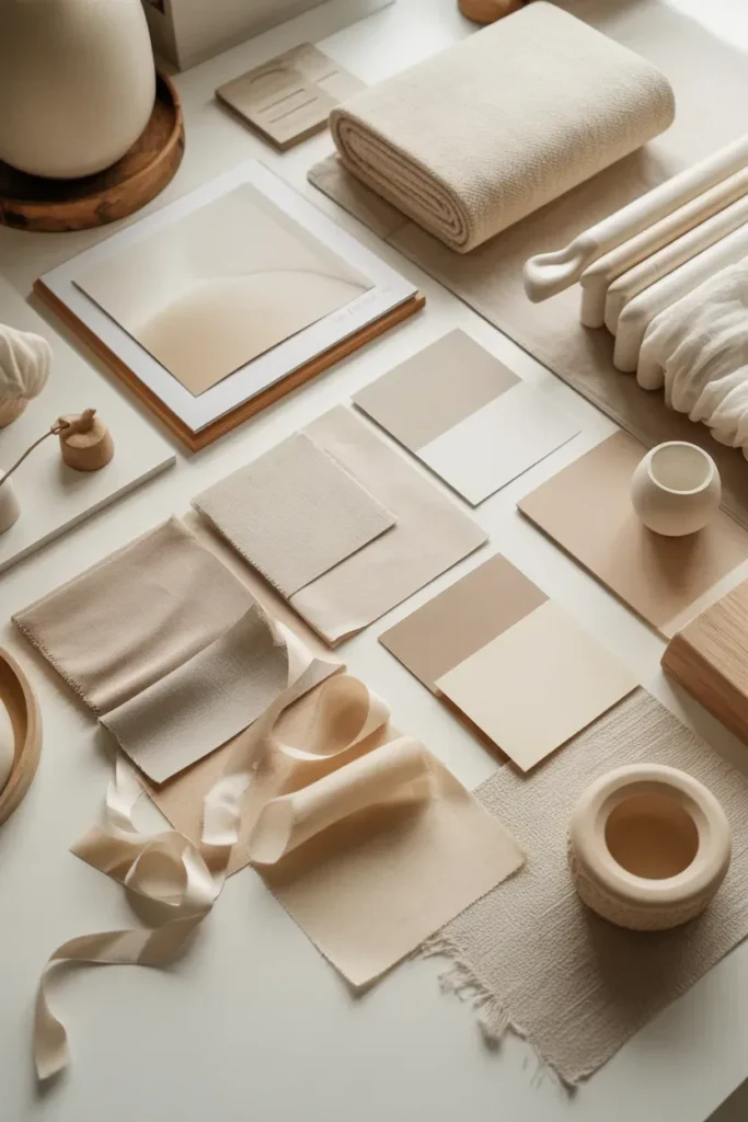
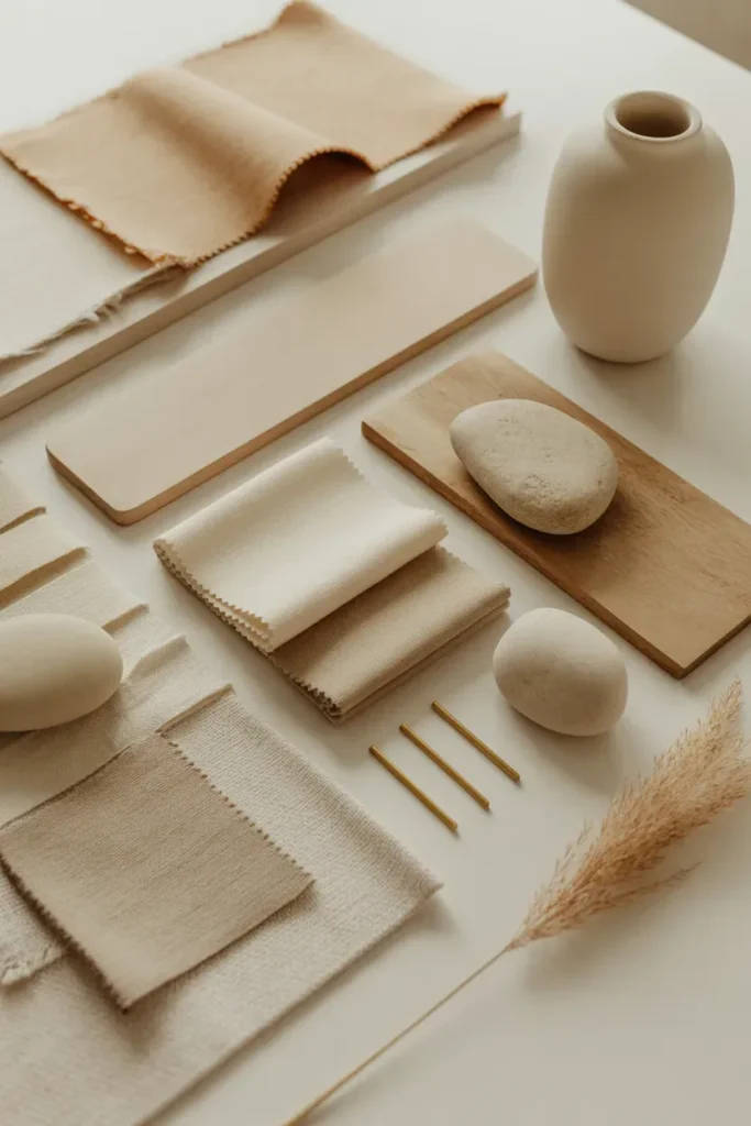
A neutral home mood board built around warm beige and soft ivory creates an instantly calming atmosphere. These tones reflect light beautifully, making any room feel airy and open. Designers often use ivory as a base while layering beige in furniture, textiles, and accessories to create gentle depth.
To elevate this palette, incorporate subtle variations such as cream, sand, and off-white. Add texture through linen fabrics, boucle upholstery, and soft rugs. This combination ensures your mood board feels rich rather than flat, setting the tone for a serene and welcoming space.
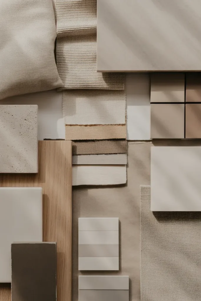
2. Greige and Taupe Layered Elegance
Greige and taupe offer a perfect balance between warm and cool neutrals. This mood board style is ideal for those who want a modern yet soft look. These tones create a sophisticated base that works well across different rooms and lighting conditions.
Layering is key—combine matte finishes, textured fabrics, and soft woods to add dimension. Designers often pair greige walls with taupe furniture and accent pieces to create a seamless, cohesive flow. The result is a timeless and refined aesthetic.
3. Earthy Neutrals with Organic Textures
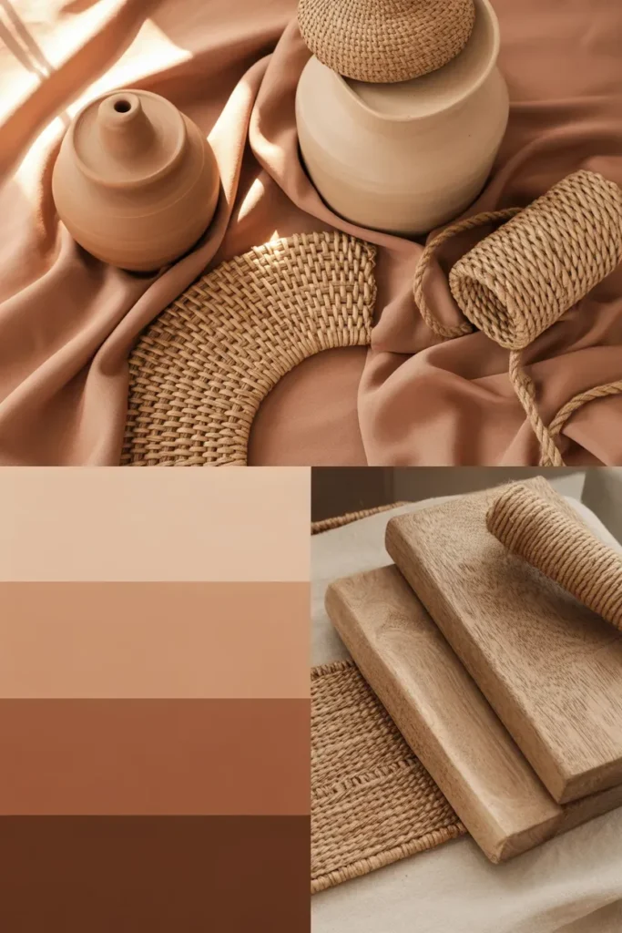
Earth-inspired neutral mood boards incorporate shades like clay, sand, and warm brown. These tones bring a grounding effect to interiors, making them feel connected to nature. Designers often combine these hues with raw materials for added authenticity.
Incorporate textures such as rattan, jute, and unfinished wood. These elements create visual interest while maintaining a calm palette. This mood board style works especially well for living rooms and relaxed spaces.
4. Soft White Minimalist Palette
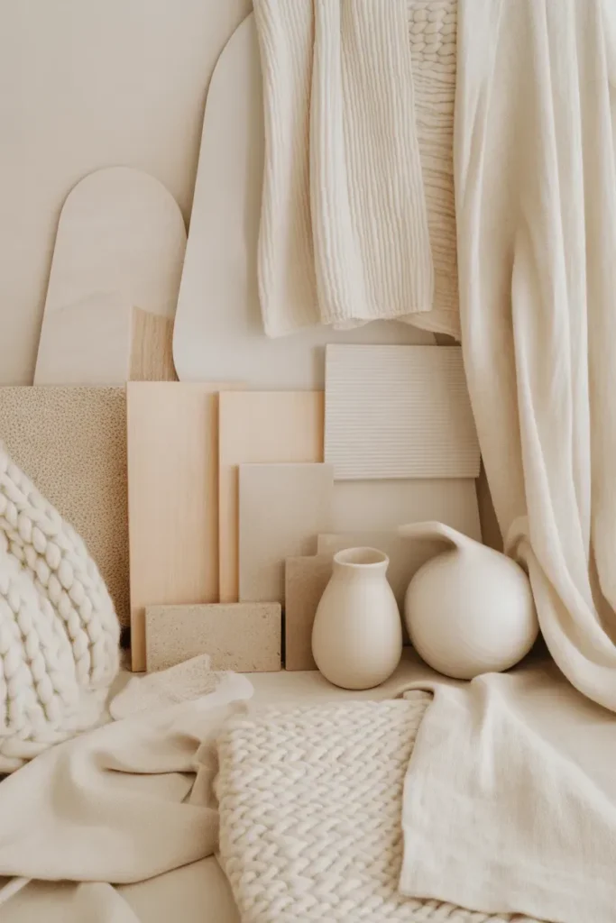
A soft white mood board is perfect for achieving a clean and tranquil interior. Unlike stark white, soft white includes warm undertones that prevent the space from feeling cold or sterile.
Designers enhance this palette by layering textures—think wool throws, linen curtains, and matte ceramics. This approach keeps the design visually engaging while maintaining simplicity. The result is a serene and refined atmosphere.
5. Neutral Mood Board with Subtle Contrast
Adding subtle contrast to a neutral mood board prevents it from feeling monotonous. Designers often introduce slightly darker tones like warm gray or muted brown to create balance.
The key is moderation—contrast should enhance, not overpower. Use darker accents in small doses through decor, trims, or textiles. This creates depth while maintaining the calm essence of the space.
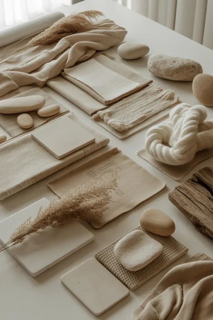
6. Linen and Fabric-Focused Mood Board
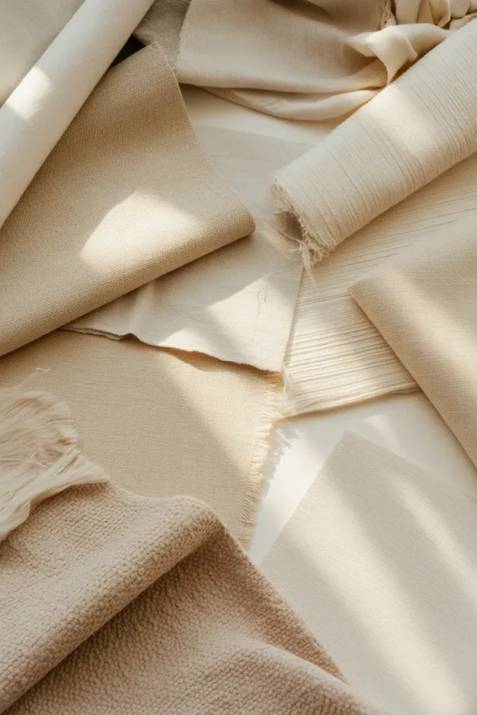
Textiles play a central role in neutral interiors, making fabric-focused mood boards highly effective. Linen, cotton, and boucle add softness and tactile appeal to the design.
Designers often combine multiple fabric samples to visualize how textures interact. This approach ensures comfort and cohesion. It’s especially useful for bedrooms and living areas where comfort is a priority.
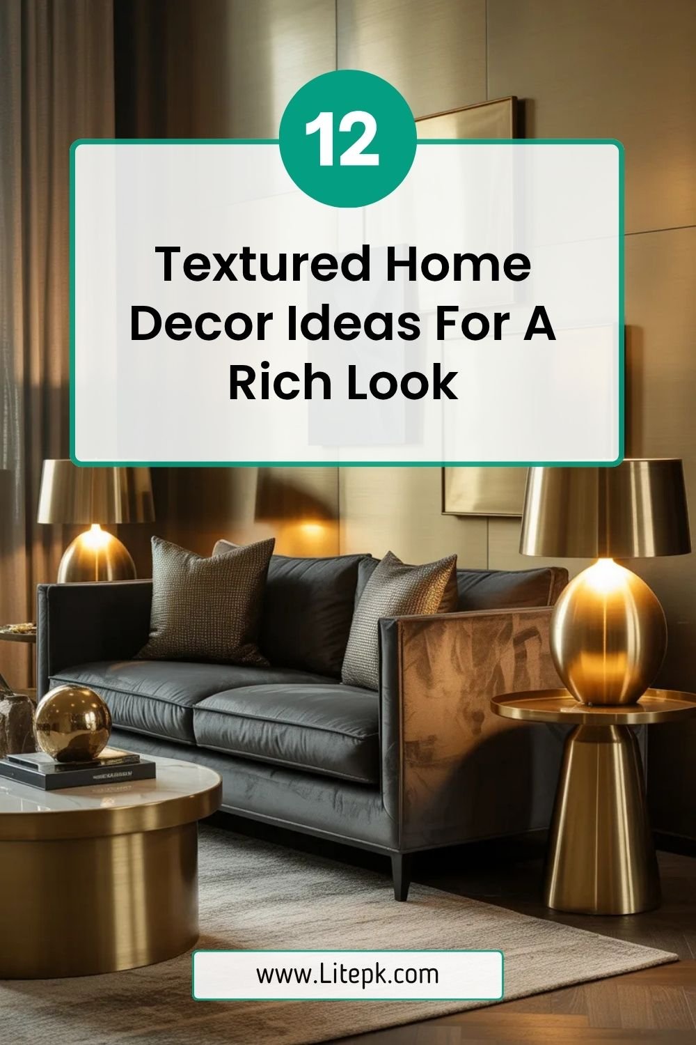
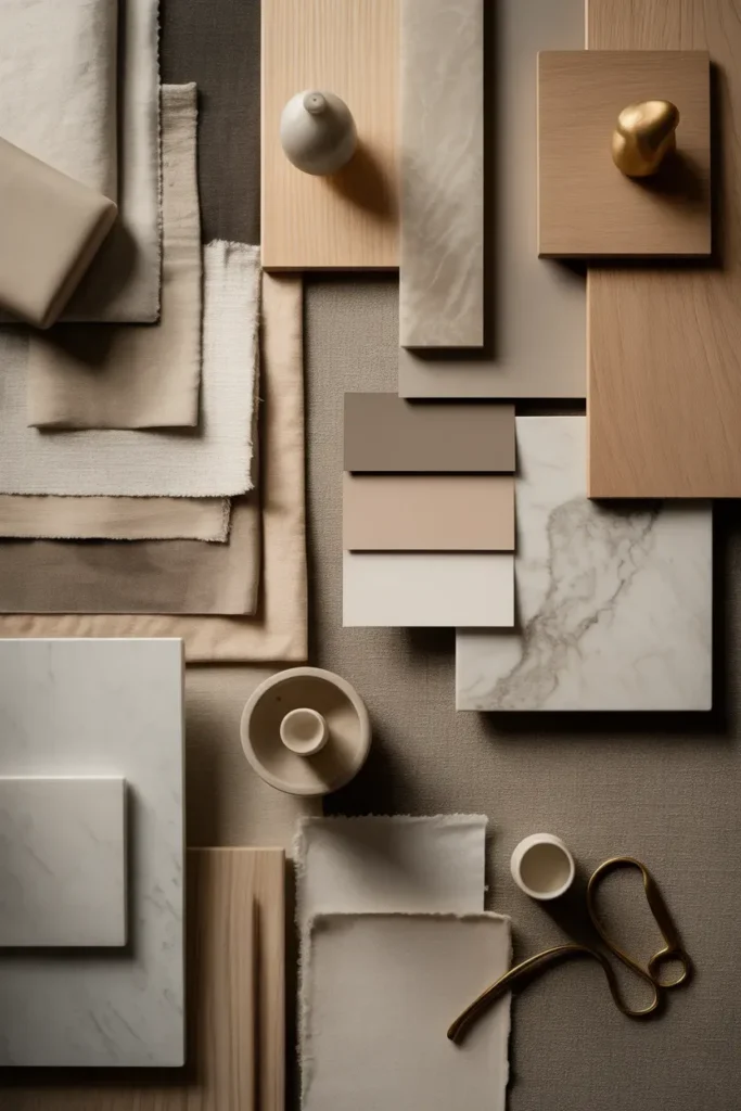
7. Stone and Marble-Inspired Palette
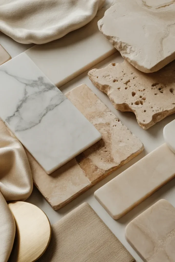
Stone-inspired mood boards introduce subtle luxury into neutral interiors. Shades of marble, travertine, and limestone create a refined and timeless look.
Pair these materials with soft fabrics to balance their hardness. Designers often use stone textures as focal elements within a neutral palette, adding sophistication without overwhelming the space.
8. Scandinavian-Inspired Neutral Board
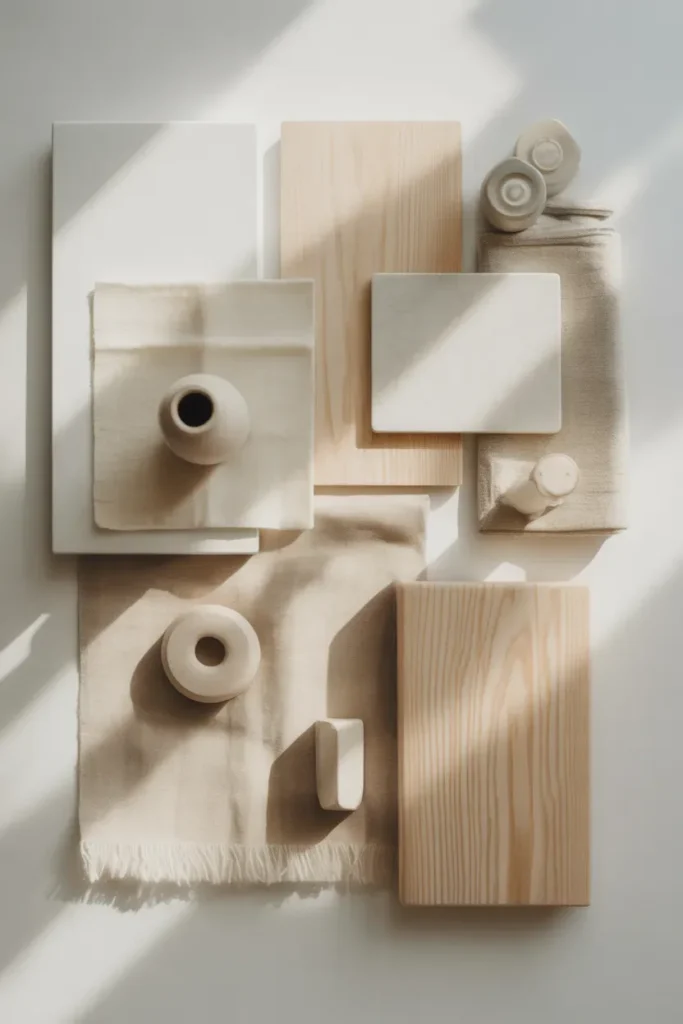
Scandinavian design emphasizes simplicity, functionality, and comfort. A neutral mood board inspired by this style focuses on light woods, soft whites, and minimal decor.
Incorporate clean lines and natural materials to achieve this look. Designers often use this approach for creating bright, airy spaces that feel both modern and cozy.
9. Warm Minimalism Mood Board
Warm minimalism blends simplicity with comfort. This mood board style uses a limited color palette while focusing on texture and material quality.
Designers avoid clutter and emphasize intentional design choices. By combining warm neutrals with clean lines, this approach creates a calming yet sophisticated environment.
10. Neutral Mood Board with Metallic Accents
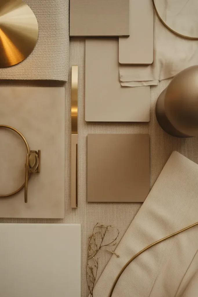
Subtle metallic elements can elevate a neutral mood board. Soft gold, brushed brass, or matte bronze add a touch of elegance without overpowering the palette.
Designers use metallics sparingly—often in lighting fixtures, hardware, or decor pieces. This creates a balanced and refined look.
11. Cozy Neutral Bedroom Mood Board
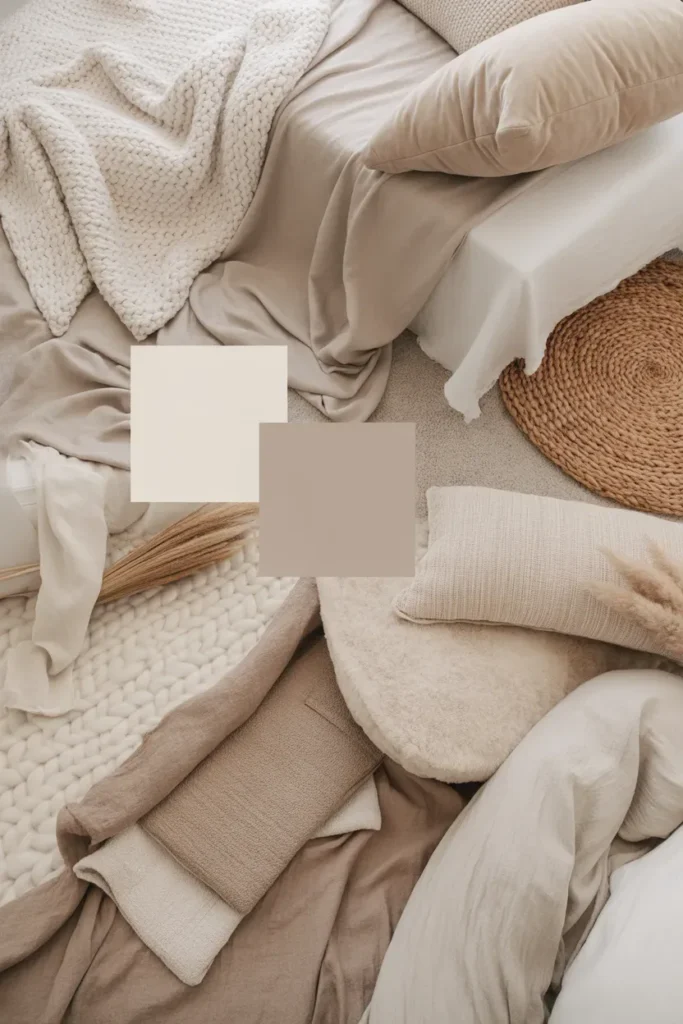
Bedrooms benefit greatly from neutral mood boards focused on comfort. Soft tones combined with plush textiles create a restful environment.
Designers often layer bedding, cushions, and rugs to enhance coziness. This approach ensures the space feels inviting and relaxing.
12. Neutral Living Room Mood Board
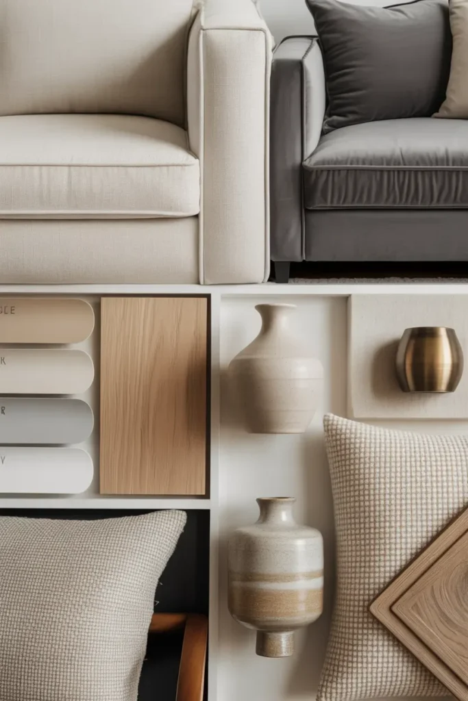
A living room mood board helps define the overall style of your home. Neutral palettes create a welcoming and versatile space suitable for various design elements.
Designers combine furniture, decor, and textures to visualize the final look. This ensures consistency and balance throughout the room.
13. Monochromatic Neutral Palette
A monochromatic neutral mood board uses variations of a single color family. This creates a cohesive and harmonious design.
Designers rely on texture and material differences to add interest. This approach is ideal for creating a clean and sophisticated look.
14. Nature-Inspired Calm Mood Board
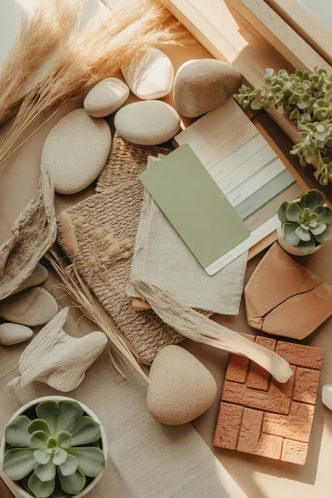
Nature-inspired mood boards incorporate soft greens, sandy tones, and organic textures. These elements create a calming and refreshing atmosphere.
Designers use plants, natural fibers, and earthy tones to enhance the connection to nature. This style is perfect for creating peaceful interiors.
Final Thoughts
A neutral home mood board is more than just a collection of colors—it’s a strategic tool that guides your entire interior design process. By carefully selecting tones, textures, and materials, you can create spaces that feel calm, cohesive, and timeless. Whether you prefer warm minimalism, Scandinavian simplicity, or earthy elegance, the right mood board ensures every element works in harmony.
The key is balance. Focus on layering textures, maintaining a consistent palette, and adding subtle contrast where needed. With these ideas, you can confidently design interiors that are not only visually stunning but also deeply relaxing and functional.