12 Moody Interior Color Schemes Designers Love
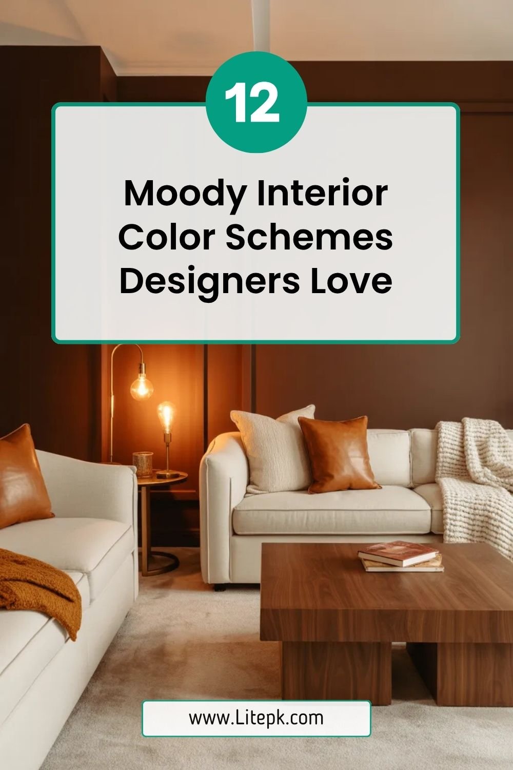
Moody interiors are no longer reserved for dramatic show homes or luxury design magazines—they’ve become one of the most sought-after aesthetics in modern living. Rich, deep tones create an atmosphere that feels intimate, sophisticated, and deeply personal. Whether you’re styling a small apartment or a sprawling home, moody color schemes can transform ordinary spaces into immersive experiences.
From charcoal blacks to forest greens and velvety burgundies, these palettes evoke emotion and character. Designers love them because they add depth, highlight textures, and elevate even the simplest furniture. In this guide, you’ll discover 12 moody interior color schemes that professionals swear by—plus how to use them effectively in your own home.
1. Charcoal Black and Warm Wood
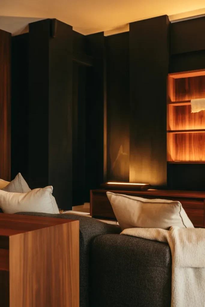
Charcoal black paired with warm wood tones is a timeless moody interior color scheme that balances drama with comfort. Designers love using deep charcoal walls to create a cocoon-like environment, especially in living rooms and bedrooms. The warmth of natural wood—whether oak, walnut, or teak—prevents the space from feeling too heavy or cold.
This combination works particularly well in spaces with layered lighting. Soft ambient lights, table lamps, and warm LED strips bring out the richness of the wood while softening the intensity of black walls. Incorporating textured fabrics like linen or wool further enhances the depth, making the room feel inviting rather than stark.
2. Deep Navy and Brass Accents
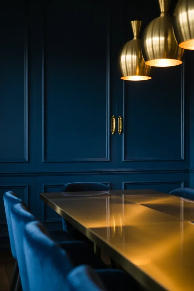
Deep navy is a designer favorite because it offers the drama of black but with added depth and richness. When paired with brass or gold accents, the result is a luxurious and elegant space that feels both modern and timeless. This scheme is often used in dining rooms, offices, and bathrooms.
Brass fixtures, lighting, and decorative elements reflect light beautifully against the dark backdrop, creating visual interest. Velvet upholstery or matte finishes enhance the moody feel, while subtle patterns can add complexity without overwhelming the space. Navy also pairs well with neutral tones, making it versatile for layering.
3. Forest Green and Matte Black
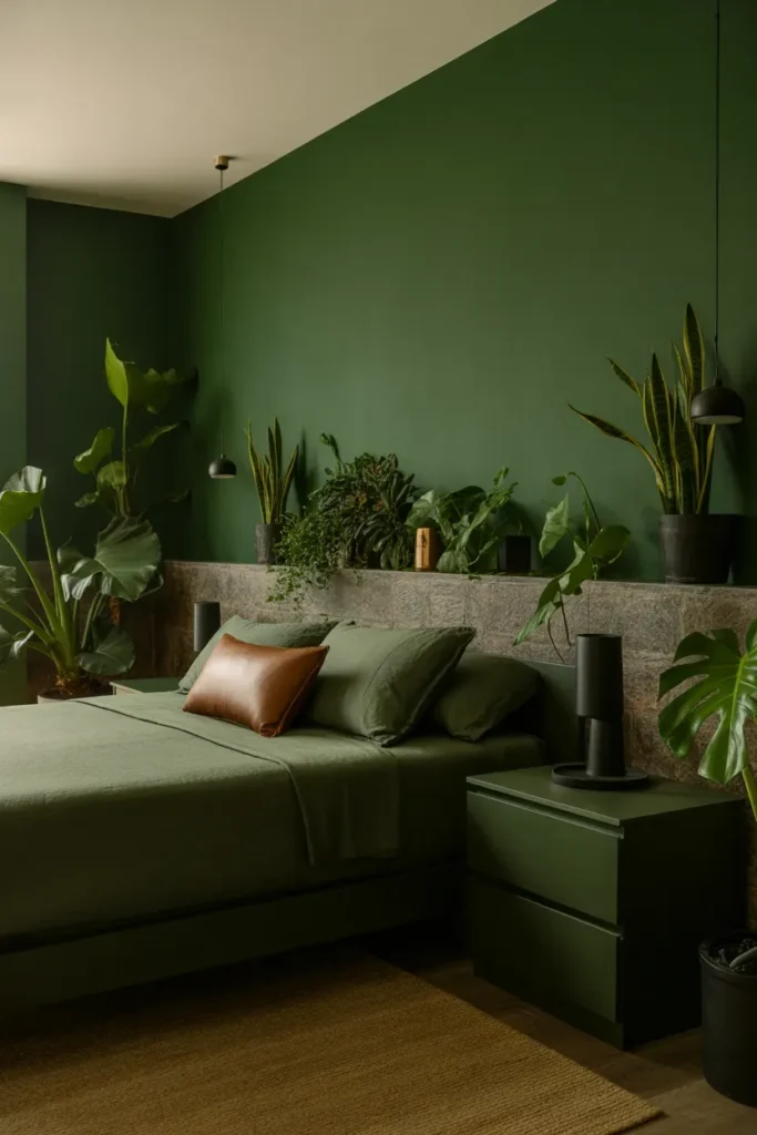
Forest green brings a natural yet dramatic feel to interiors. Combined with matte black finishes, it creates a grounded, earthy palette that feels sophisticated and calming. Designers often use this scheme in bedrooms and reading spaces to evoke tranquility.
Adding plants or botanical elements enhances the organic vibe, while black metal fixtures and furniture provide structure. This palette works beautifully with natural materials like stone and leather, creating a layered and tactile environment that feels both modern and timeless.
4. Burgundy and Blush Pink
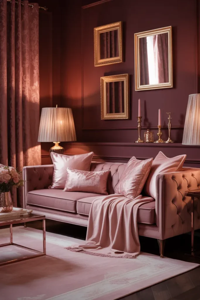
Burgundy is rich, bold, and deeply moody, while blush pink softens its intensity. This pairing creates a romantic and sophisticated atmosphere that designers love for bedrooms and lounge areas. The contrast between deep and soft tones adds visual balance.
Velvet fabrics, soft rugs, and layered textiles enhance the luxurious feel of this palette. Gold or rose gold accents can elevate the scheme further, while subtle patterns keep the design dynamic. This combination is perfect for those who want a moody look without going too dark.
5. Dark Teal and Walnut
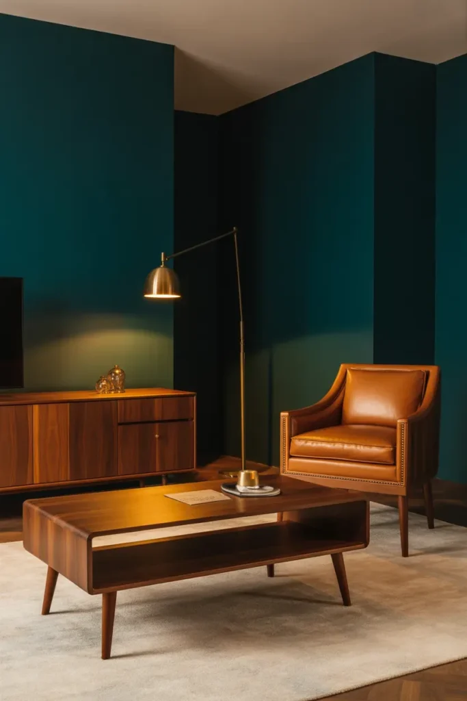
Dark teal is a bold yet refined color that brings depth and character to any space. When paired with walnut wood, it creates a rich, mid-century modern aesthetic that designers frequently use in living rooms and offices.
The cool undertones of teal contrast beautifully with the warmth of walnut, creating a balanced palette. Adding metallic accents or leather furniture enhances the sophistication, while layered lighting highlights the textures and tones.
6. Slate Gray and Soft Cream
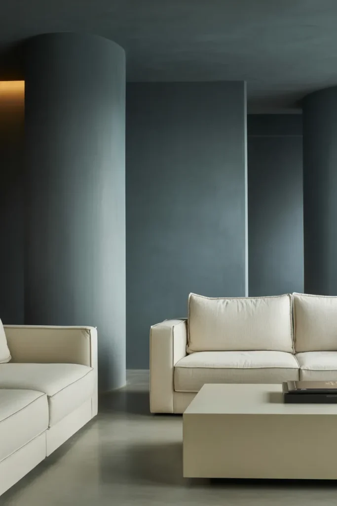
Slate gray offers a softer alternative to black while still maintaining a moody aesthetic. Paired with soft cream tones, it creates a balanced and calming environment that feels both modern and timeless.
This palette works well in minimalist interiors, where clean lines and simple forms are emphasized. The contrast between gray and cream adds depth without overwhelming the space, making it ideal for open-plan living areas.
7. Chocolate Brown and Ivory
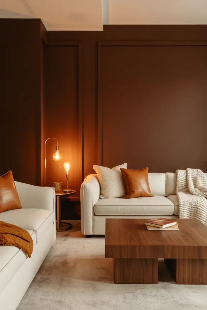
Chocolate brown is making a strong comeback in interior design. When paired with ivory, it creates a warm and inviting moody palette that feels grounded and sophisticated.
Designers often use this scheme in living rooms and bedrooms to create a cozy atmosphere. Layering textures like leather, wool, and wood enhances the richness of the palette, while soft lighting adds warmth.
8. Plum Purple and Charcoal
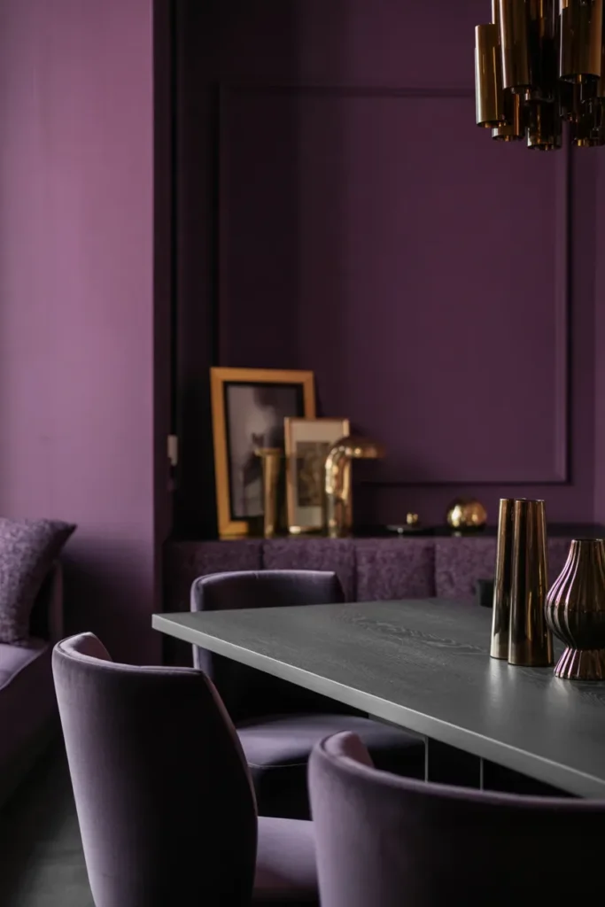
Plum purple adds a touch of drama and luxury to interiors. Combined with charcoal, it creates a deep, moody palette that feels bold and artistic.
This scheme is often used in statement spaces like dining rooms or accent walls. Metallic accents and rich fabrics like velvet enhance the luxurious feel, while strategic lighting highlights the depth of the colors.
9. Olive Green and Aged Brass
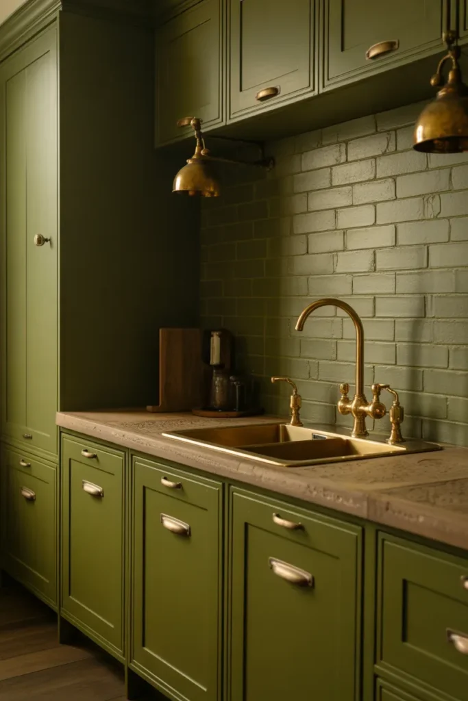
Olive green is subtle yet moody, offering a natural and understated elegance. Paired with aged brass, it creates a vintage-inspired palette that designers love for kitchens and bathrooms.
The muted tone of olive green works beautifully with textured surfaces like stone or tile. Brass fixtures add warmth and character, while soft lighting enhances the overall ambiance.
10. Midnight Blue and Crisp White
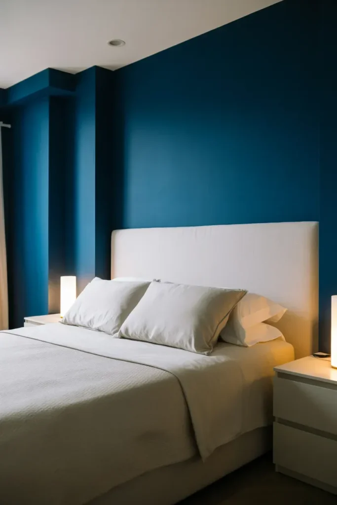
Midnight blue provides a dramatic backdrop, while crisp white adds contrast and brightness. This combination creates a bold yet balanced interior that feels modern and fresh.
Designers often use this palette in bedrooms and bathrooms, where contrast enhances visual interest. Clean lines and minimal decor keep the space from feeling too heavy, while layered lighting adds depth.
11. Black and Deep Red
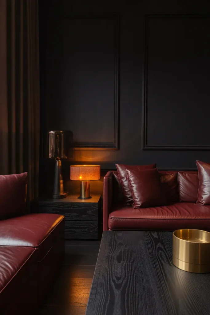
Black and deep red create a powerful and dramatic color scheme that exudes confidence and sophistication. This palette is often used in statement spaces where impact is key.
Rich fabrics, dark wood, and metallic accents enhance the intensity of the colors. Proper lighting is essential to prevent the space from feeling too dark, ensuring a balanced and inviting atmosphere.
12. Smoky Blue and Taupe
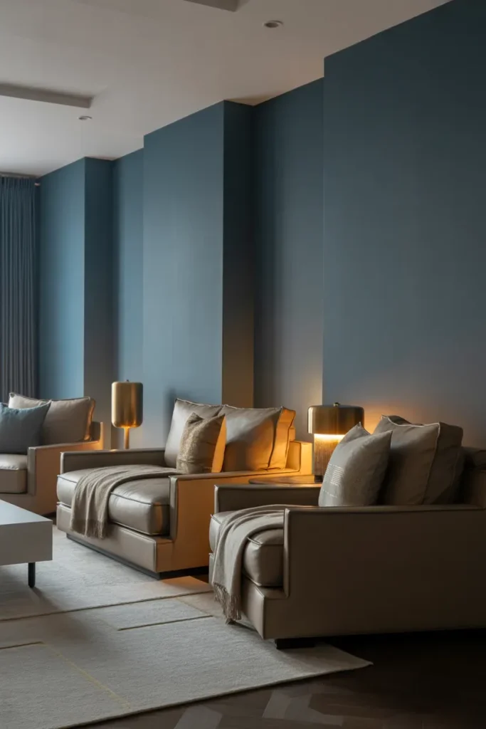
Smoky blue offers a softer take on moody interiors, while taupe adds warmth and neutrality. This combination creates a serene and sophisticated environment that feels both modern and timeless.
Designers love using this palette in bedrooms and living spaces where relaxation is key. Layered textiles and subtle patterns add depth, while soft lighting enhances the calming effect.
Final Thoughts
Moody interior color schemes are more than just a trend—they are a powerful design approach that transforms how a space feels and functions. By carefully combining deep tones with complementary accents, you can create interiors that are both dramatic and inviting.
Whether you prefer bold contrasts or subtle layers, these designer-approved palettes offer endless inspiration. The key is to balance darkness with warmth, texture, and light, ensuring your space feels cohesive and comfortable.