14 Warm Neutral Color Palette Ideas Designers Love

Warm interiors are redefining contemporary design by creating spaces that feel emotionally grounding while maintaining a refined visual identity. Designers increasingly rely on a warm neutral color palette to craft homes that feel both sophisticated and inviting. Unlike stark minimalism or trend-driven color schemes, warm neutrals offer timeless balance, allowing architectural forms and sculptural decor elements to take center stage.
From serene bedrooms to sculptural living rooms, a well-composed warm neutral color palette introduces depth through texture rather than contrast. These tones support natural light, organic materials, and layered styling, resulting in interiors that feel curated rather than decorated. The following designer-approved palettes demonstrate how warmth, simplicity, and intentional design can coexist beautifully.
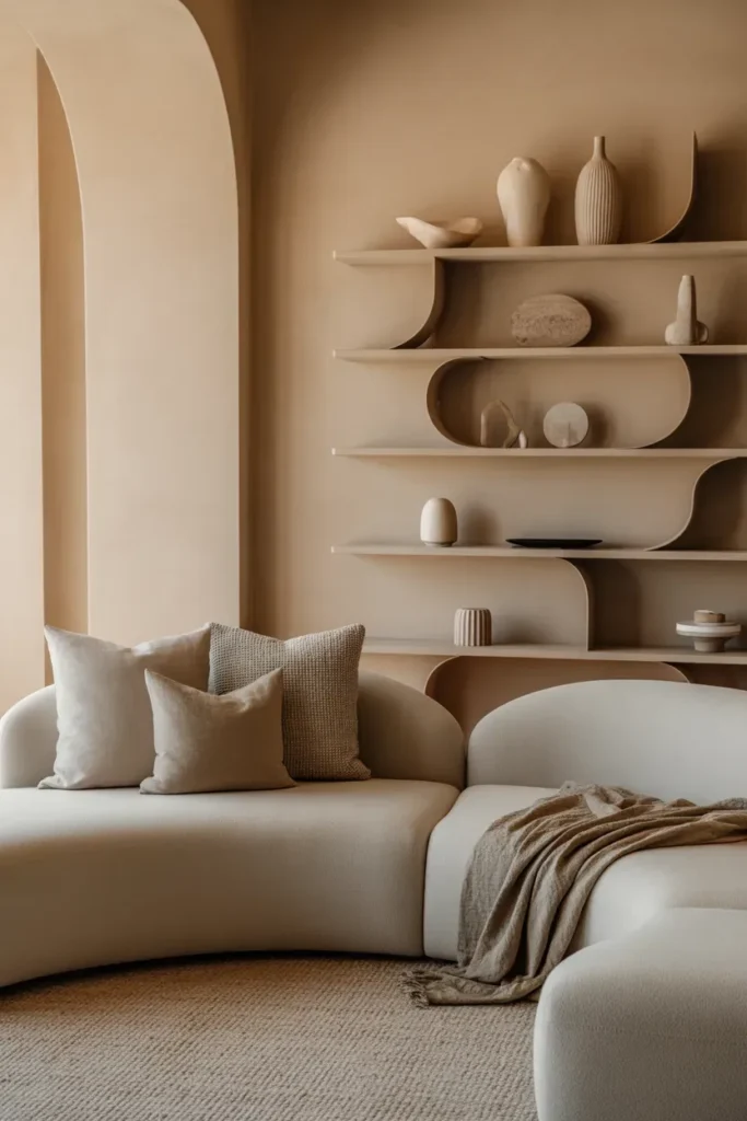
1. Cream and Sand Serenity
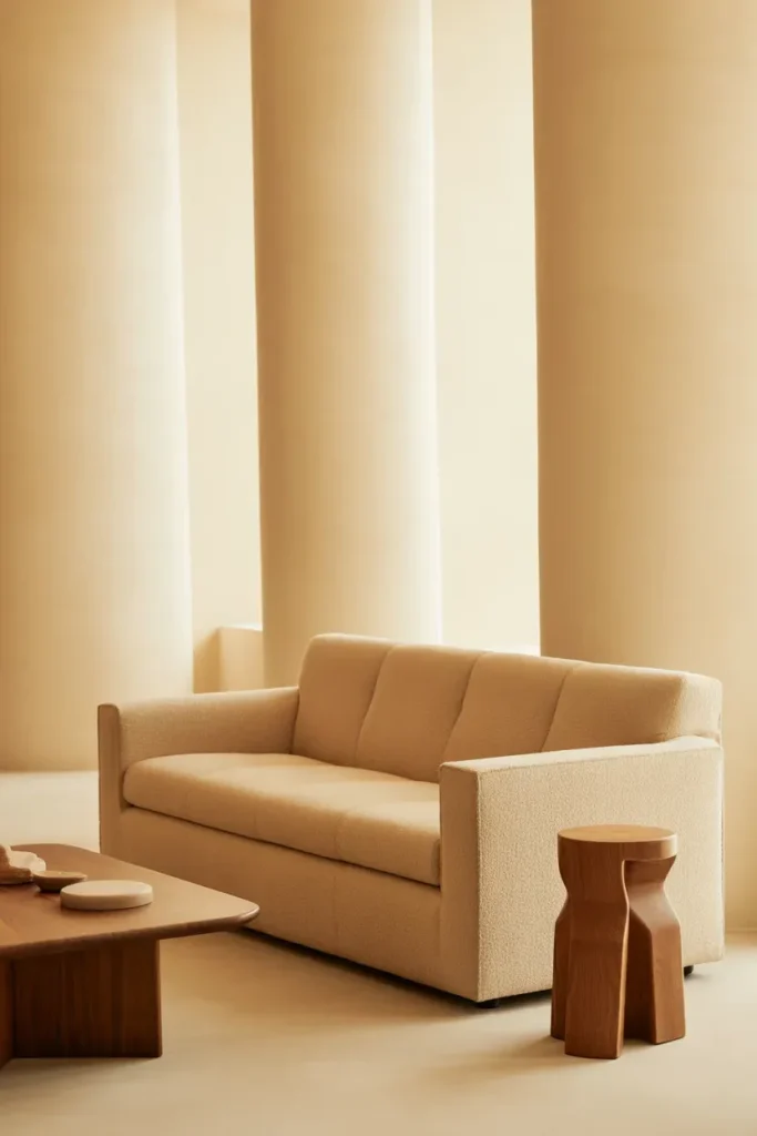
A cream and sand warm neutral color palette establishes a tranquil visual rhythm that enhances both natural light and spatial clarity. Designers favor this pairing because it allows sculptural furniture and architectural lines to stand out without visual noise. Cream walls provide a luminous canvas, while sand-toned upholstery and textiles introduce depth through subtle tonal layering rather than dramatic contrast.
To elevate this palette, designers integrate tactile materials such as linen drapery, jute rugs, matte ceramics, and unfinished wood finishes. These elements create a sensory experience that feels warm yet sophisticated. This palette is particularly effective in living rooms and bedrooms where emotional comfort and visual calm are essential to the overall design narrative.
2. Warm Beige and Taupe Harmony
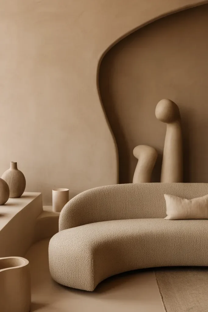
Warm beige and taupe form a warm neutral color palette that embodies balance, depth, and understated luxury. Beige introduces softness and warmth, while taupe anchors the composition with subtle richness. Designers rely on this pairing to create interiors that feel layered without appearing visually cluttered or overly styled.
This palette becomes especially impactful when combined with curved furniture silhouettes and textured architectural surfaces. Taupe plaster walls paired with beige bouclé seating create a tonal dialogue that feels both contemporary and timeless. Matte finishes, woven textiles, and sculptural lighting further enhance the organic elegance of the space.
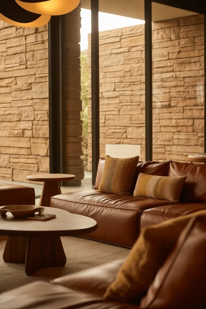
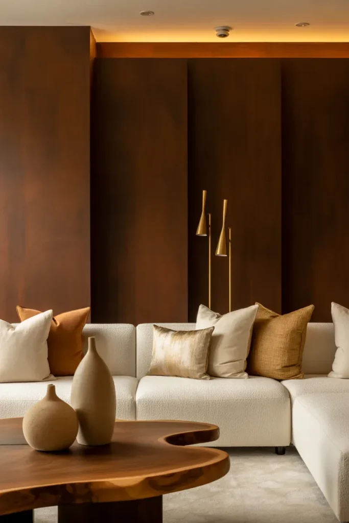
3. Caramel and Ivory Comfort
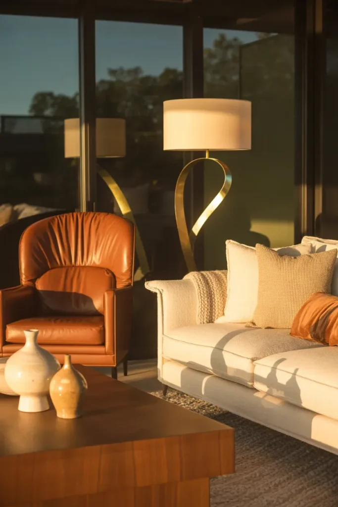
Caramel and ivory together create a warm neutral color palette that balances richness with softness. Designers frequently introduce caramel tones through leather seating, wood finishes, or accent decor to establish depth and warmth. Ivory textiles and walls provide luminous contrast that keeps the interior feeling light and inviting.
Layered textures enhance the tactile dimension of this palette. Wool throws, handcrafted ceramics, and sculptural floor lamps contribute to a curated aesthetic that feels luxurious without becoming overwhelming. This combination is particularly effective in cozy living spaces where comfort and visual warmth are key design priorities.
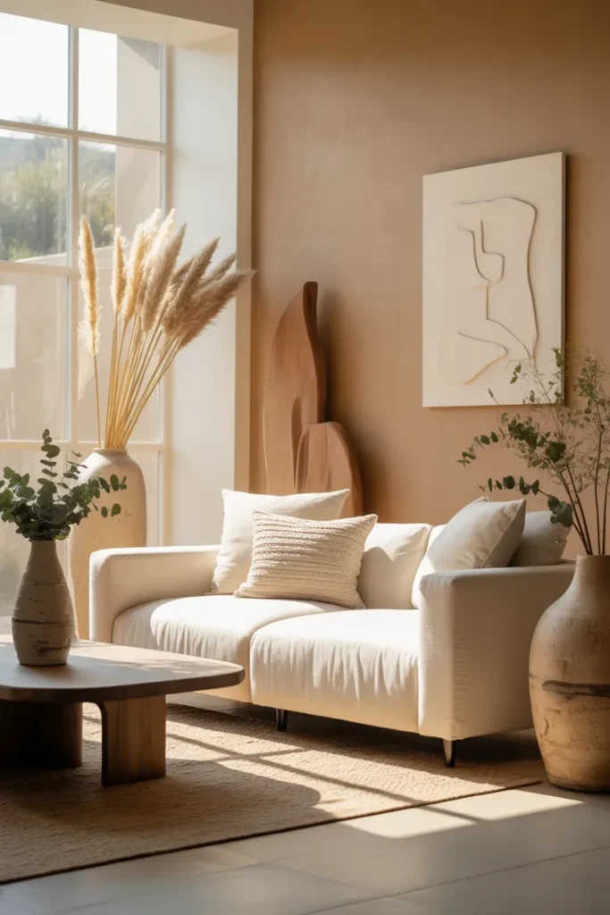
4. Terracotta and Warm White Balance
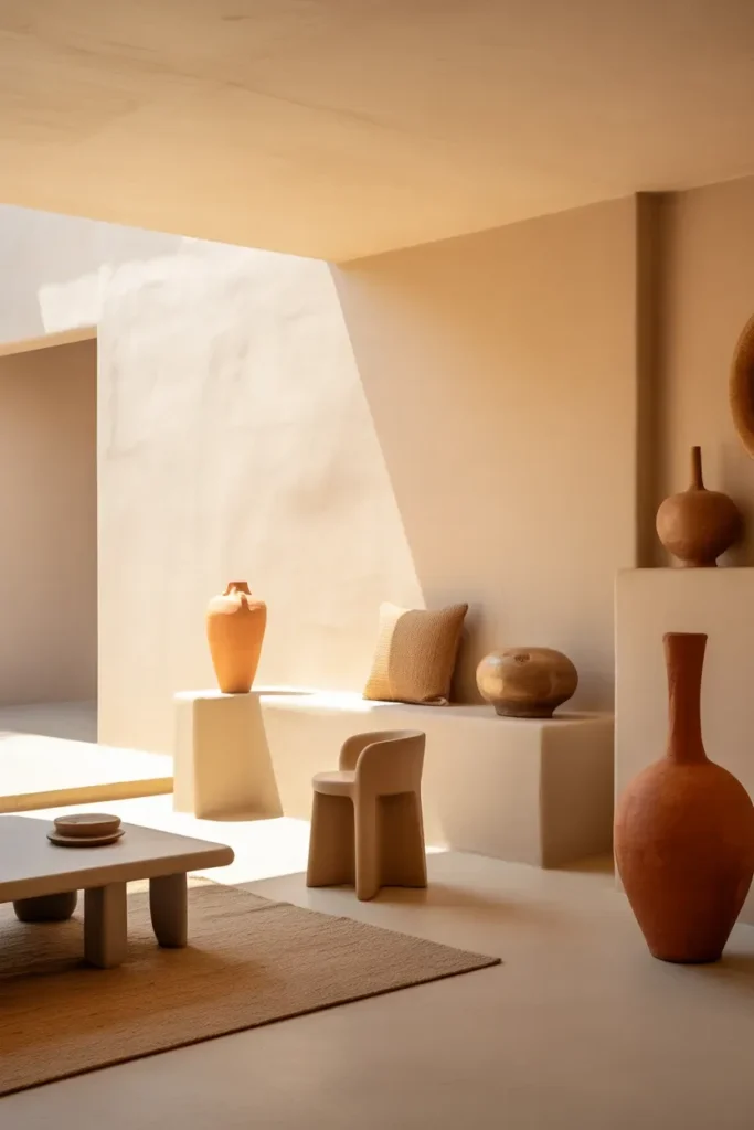
Terracotta introduces earthy authenticity into a warm neutral color palette, while warm white ensures visual lightness and spatial clarity. Designers use terracotta accents to add personality without disrupting the neutral harmony of a room. This pairing bridges rustic warmth with contemporary simplicity.
Clay ceramics, textured plaster finishes, and woven textiles enhance the sculptural presence of the palette. Warm white walls reflect light gently, allowing terracotta tones to shift throughout the day. This dynamic interaction between color and natural light creates interiors that feel grounded, organic, and visually engaging.
5. Soft Mocha and Linen Layers
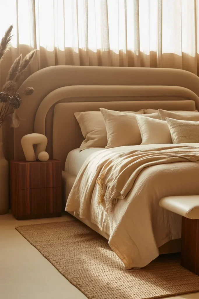
Soft mocha paired with linen tones creates a warm neutral color palette that feels deeply comforting while maintaining visual sophistication. Designers often use mocha hues to introduce grounded richness that enhances intimacy in a space, while linen tones soften the overall composition by reflecting light gently. This tonal harmony ensures interiors feel warm without appearing heavy or overly dramatic.
To fully realize the sculptural elegance of this palette, layering tactile materials is essential. Linen bedding, woven rugs, upholstered headboards, and matte wood finishes create a balanced sensory experience. Sculptural bedside lighting and organic decor pieces enhance visual interest, making this palette particularly effective in bedrooms and lounge areas designed to feel calm, restorative, and timeless.
6. Honey Oak and Creamy White Warmth
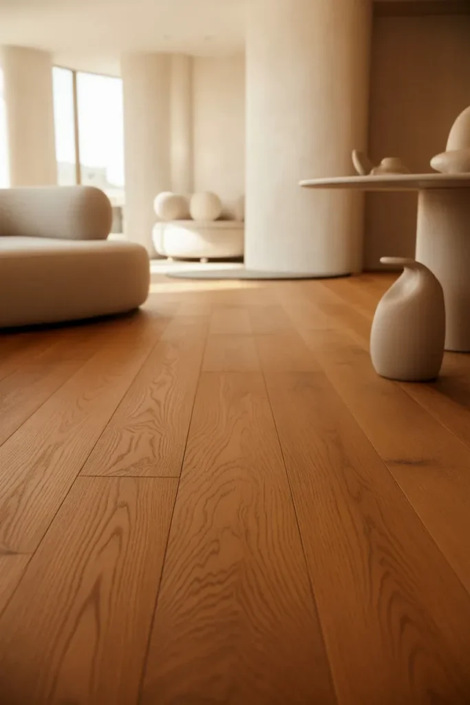
Honey oak introduces natural warmth that instantly makes interiors feel welcoming and grounded. When paired with creamy white, this warm neutral color palette achieves a refined balance between traditional comfort and contemporary simplicity. Designers frequently incorporate honey oak through flooring, cabinetry, or statement furniture to create continuity and visual cohesion across open-plan spaces.
Creamy white walls and textiles soften the visual intensity of wood tones, ensuring the design remains fresh and modern rather than nostalgic. Sculptural decor, curved seating, and matte ceramic accessories further elevate the palette. The result is an interior that feels timeless, functional, and aesthetically balanced, making it ideal for living rooms, kitchens, and transitional spaces.
7. Clay Beige and Muted Gold Elegance
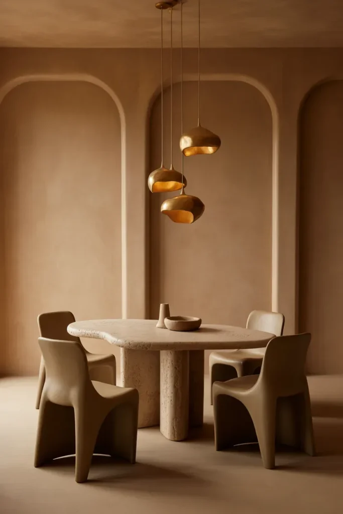
Clay beige offers an earthy foundation that feels both grounded and refined, while muted gold introduces subtle sophistication into the warm neutral color palette. Designers often choose this combination to create interiors that convey understated luxury without relying on bold contrasts or ornate detailing. The warmth of clay tones ensures the space feels inviting, while gold accents add visual depth and richness.
This palette becomes especially effective when paired with textured plaster walls, stone surfaces, and sculptural furniture forms. Muted gold lighting fixtures, decorative objects, and hardware provide gentle highlights that enhance the overall composition. The result is an interior that feels elegant, contemporary, and emotionally warm, making it ideal for dining areas and formal living spaces.
8. Almond and Soft Greige Sophistication
Almond and soft greige together create a warm neutral color palette that feels modern, serene, and effortlessly refined. Almond tones introduce gentle warmth that softens the atmosphere, while greige provides grounding depth without appearing cold or stark. Designers frequently use this pairing to create interiors that balance minimalism with emotional comfort.
Layered textiles, sculptural shelving, and organic ceramics enhance the visual richness of this palette. Matte finishes and curved furniture silhouettes further support the sculptural decorating narrative. This palette works particularly well in contemporary living rooms and creative workspaces where visual calm supports productivity and relaxation simultaneously.
9. Cinnamon Brown and Warm Stone Depth
Cinnamon brown combined with warm stone tones forms a warm neutral color palette that emphasizes architectural depth and organic sophistication. Designers often use cinnamon hues to introduce richness without relying on darker contrasts that may visually shrink a space. Warm stone surfaces provide balance, ensuring the interior remains breathable and cohesive.
Textural layering is crucial to bringing this palette to life. Stone feature walls, wood grain furniture, woven textiles, and sculptural lighting elements contribute to a tactile environment that feels curated rather than staged. This palette is particularly effective in expansive living areas where warmth helps create intimacy and visual continuity throughout the space.
10. Latte and Soft Cream Minimalism
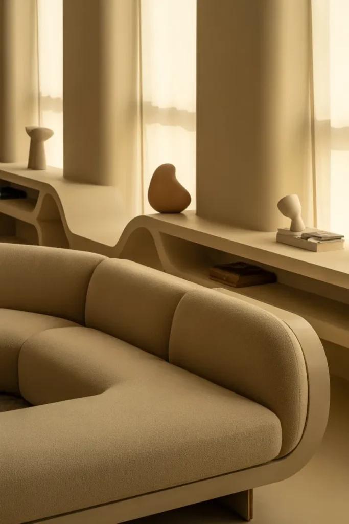
Latte tones paired with soft cream create a warm neutral color palette that embodies refined minimalism while maintaining emotional warmth. Designers often rely on latte shades to introduce depth through furniture upholstery, wooden accents, or sculptural decor elements. Soft cream walls provide a luminous foundation that enhances spatial openness and allows subtle tonal contrasts to emerge naturally.
This palette works exceptionally well in contemporary interiors where simplicity and intentional styling are prioritized. Curved silhouettes, matte finishes, and layered textiles contribute to a sculptural aesthetic that feels both modern and timeless. The combination of latte and cream establishes a calming environment that supports relaxation and visual clarity, making it ideal for urban apartments and modern family homes.
11. Sandstone and Warm Taupe Texture
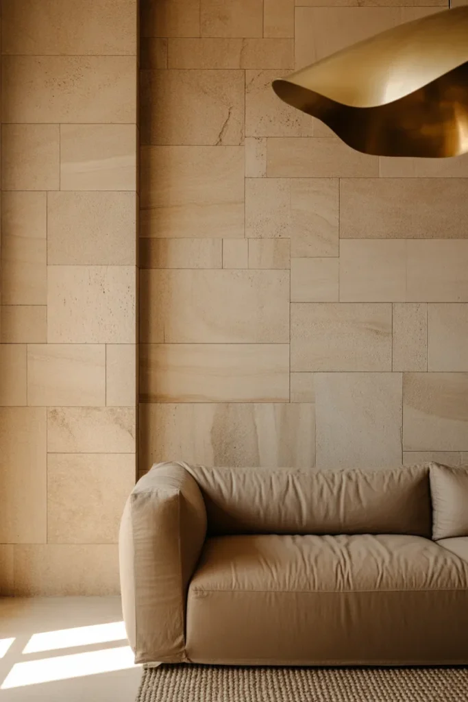
Sandstone and warm taupe together form a warm neutral color palette that highlights materiality and tactile richness. Designers frequently use sandstone hues to introduce organic warmth, while taupe adds grounding depth that enhances the architectural character of a space. This pairing creates a harmonious balance between softness and structure.
To achieve a sculptural decorating effect, layering textures such as plaster walls, woven textiles, and matte stone surfaces is essential. Sculptural lighting fixtures and curved architectural details further amplify the palette’s visual depth. This combination is particularly effective in contemporary homes that prioritize quiet luxury and understated elegance.
12. Cocoa and Vanilla Contrast
Cocoa and vanilla tones create a warm neutral color palette that balances richness with brightness, offering a dynamic yet harmonious interior composition. Designers often use cocoa for grounding elements such as cabinetry, feature walls, or statement furniture, while vanilla tones provide softness that prevents the space from feeling visually heavy.
The palette thrives when paired with organic materials and sculptural forms. Matte ceramics, wooden accents, and layered textiles enhance the tactile experience, creating interiors that feel cozy yet refined. This combination is ideal for living rooms and dining areas designed to foster comfort while maintaining a sophisticated editorial aesthetic.
13. Dusty Rose Neutral Blend
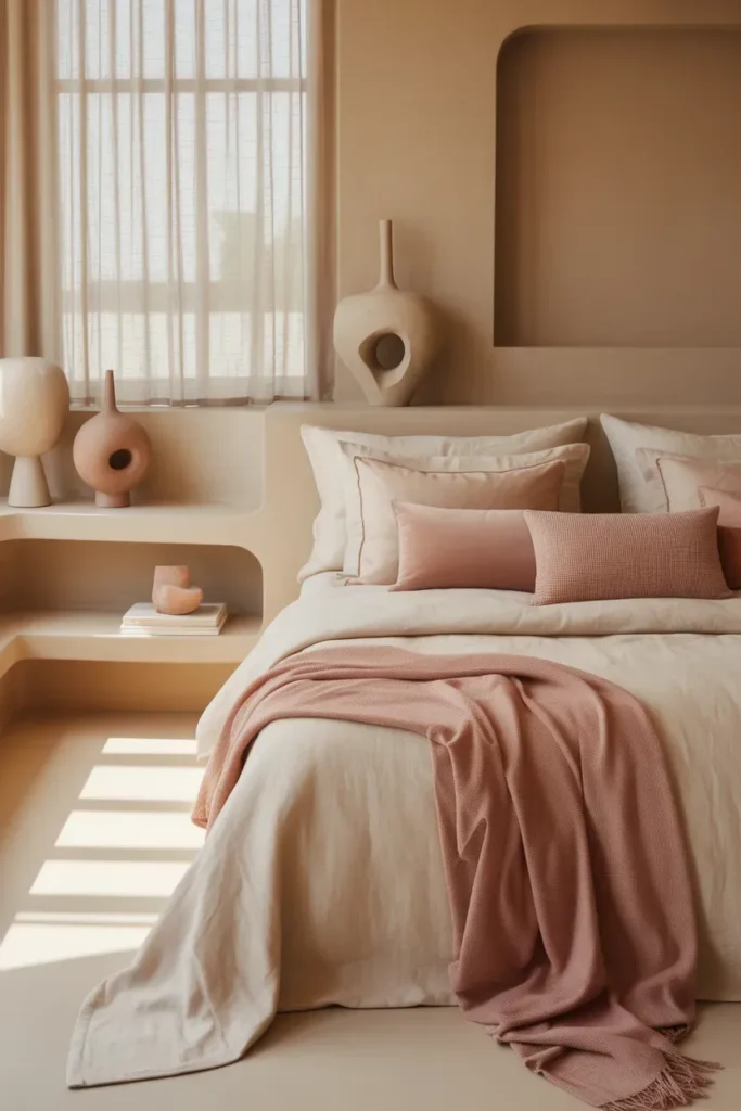
Dusty rose subtly integrated into a warm neutral color palette introduces emotional warmth without disrupting tonal harmony. Designers often incorporate dusty rose through textiles, accent decor, or upholstered furniture to create a gentle contrast within beige or cream environments.
Soft fabrics, sculptural decor elements, and matte finishes ensure the palette maintains its refined aesthetic. This combination works particularly well in bedrooms, boutique-inspired living rooms, and creative spaces where subtle color variation enhances comfort and individuality. The result is an interior that feels personal, elegant, and visually balanced.
14. Warm Clay and Natural Linen Organic Calm
Warm clay tones paired with natural linen textures create a warm neutral color palette that embodies organic modern design principles. Designers favor this pairing for its grounding presence and ability to connect interiors with natural materials. Clay introduces earthy richness, while linen softens the palette with breathable lightness.
Layered textiles, handcrafted ceramics, and sculptural wooden decor enhance the authenticity of the design narrative. This palette is particularly effective in living rooms and bedrooms where calm, comfort, and connection to nature are central design goals. The overall effect is an environment that feels timeless, restorative, and visually harmonious.
Conclusion: Designing Timeless Interiors with a Warm Neutral Color Palette
A thoughtfully curated warm neutral color palette remains one of the most powerful tools designers use to create interiors that feel both emotionally comforting and visually sophisticated. Unlike trend-driven color schemes that can quickly feel dated, warm neutrals establish a timeless design foundation rooted in texture, materiality, and spatial harmony. By prioritizing tonal layering over contrast, these palettes allow sculptural furniture, organic materials, and architectural forms to become the focal points of a space.
Throughout modern interior design, the appeal of warm neutrals lies in their ability to adapt to various styles — from minimalist urban apartments to expansive organic luxury homes. Creams, taupes, soft browns, and clay tones work together to create a visual language that feels cohesive yet dynamic. Designers often emphasize subtle tonal shifts, matte finishes, and natural textures to achieve interiors that feel curated rather than decorated. This sculptural decorating approach ensures that spaces remain visually engaging while maintaining an atmosphere of calm and balance.
Another defining characteristic of a warm neutral color palette is its interaction with natural light. Warm tones respond beautifully to daylight, shifting in depth and richness throughout the day. This dynamic quality enhances spatial perception and creates interiors that feel alive rather than static. By integrating materials such as linen, stone, wood, and plaster, designers can amplify this effect, resulting in environments that feel deeply connected to nature and human experience.
Functionality also plays a key role in the enduring popularity of warm neutral interiors. These palettes support flexible styling, making it easier to update decor elements without disrupting the overall design narrative. A neutral foundation allows homeowners to experiment with sculptural decor, curated art pieces, or seasonal accents while maintaining visual continuity. This adaptability makes warm neutrals a practical yet aesthetically sophisticated choice for modern living.
From a psychological perspective, warm neutral color palettes contribute to emotional wellbeing by fostering a sense of comfort and stability. Soft earthy tones evoke familiarity and warmth, creating spaces that encourage relaxation and mindfulness. Designers often leverage this emotional resonance when creating bedrooms, living rooms, and communal areas where comfort and connection are essential. The subtle elegance of warm neutrals ensures that interiors feel welcoming without sacrificing refinement.
Sustainability is another reason why designers increasingly embrace warm neutral palettes. Natural materials associated with these tones — such as wood, clay, and stone — align with eco-conscious design principles. By prioritizing durability and timeless aesthetics, warm neutral interiors reduce the need for frequent redesigns, supporting more sustainable consumption patterns. This approach reflects a broader shift toward intentional living and environmentally responsible design.
Ultimately, a warm neutral color palette offers more than aesthetic appeal; it represents a design philosophy centered on balance, authenticity, and longevity. By focusing on sculptural forms, layered textures, and harmonious tonal relationships, designers can create interiors that transcend fleeting trends. Whether applied in small urban spaces or expansive residential projects, warm neutrals provide a foundation that supports both creative expression and enduring beauty.
As interior design continues to evolve, the role of warm neutrals will remain central to creating environments that feel both contemporary and timeless. Their ability to bridge modern minimalism with organic warmth ensures their relevance across generations of design innovation. For homeowners and designers alike, embracing a warm neutral palette is not simply a stylistic choice — it is an investment in creating spaces that nurture comfort, inspire creativity, and stand the test of time.